Widget customization
Configure the chatbot and search widgets by setting HTML attributes. All properties support i18n — override any text property to localize the widget.
biel-button
The <biel-button> component adds a floating AI chat button to your site.
Usage
<biel-button project="YOUR_PROJECT_ID" header-title="Biel.ai chatbot" button-style="dark">Ask AI</biel-button>
Chatbot button properties
| Property | Description |
|---|---|
| Layout | |
project | Required Type: stringThe project ID. |
button-position | Type: stringDefault value: defaultAvailable values: default, bottom-right, bottom-left, center-right, center-left, custom Controls the position of the chat button on your webpage. Use custom to position the button using CSS. |
button-style | Type: stringDefault value: defaultAvailable values: default, dark, lightDefines the visual style of the chat button. dark uses a dark theme, light uses a light theme, and default follows your site's theme. |
custom-font | Type: booleanDefault value: falseWhen set to true, disables loading of the Inter font. Use this if your site already uses a different font to improve load time and maintain font consistency. |
hide-icon | Type: booleanDefault value: falseWhen set to true, the button icon hides. |
ai-icon | Type: stringDefault value: botAvailable values: bot, sparks, question-markSpecifies which AI icon to display in the button. |
hide-avatars | Type: booleanDefault value: falseWhen set to true, hides avatars in the chat interface. |
api-key | Type: stringDefault value: `` API key for authenticating requests to private projects. Required for private projects with create_chat and project_read permissions. Not required for public projects. |
api-url | Type: stringDefault value: https://app.biel.aiOverride the base API URL. Use this for self-hosted or custom API endpoints. |
embedded-mode | Type: booleanDefault value: falseRenders the chatbot inline in the page layout instead of as a floating button. See Embedded mode. |
show-powered-by | Type: booleanDefault value: trueShow or hide the "Powered by Biel.ai" text. Hiding requires a Professional plan or above. |
Chatbot modal properties
| Property | Description |
|---|---|
| Layout | |
disable-input | Type: booleanDefault value: falseWhen set to true, the user input field is disabled. |
email | Type: stringDefault value: `` An email address or ID for conversation tracking. This ID will be associated with the chat session in your project dashboard for analytics and user tracking purposes. |
metadata | Type: stringDefault value: `` Custom metadata to attach to chat sessions. Use this to pass additional contextual information (e.g., user plan, page URL, or other identifiers) that will be associated with the conversation for analytics purposes. |
expand-modal | Type: booleanDefault value: falseWhen set to true, the chat modal opens in its expanded state by default. |
hide-close-button | Type: booleanDefault value: falseWhen set to true, the close icon hides. |
hide-expand-button | Type: booleanDefault value: falseWhen set to true, the expand button icon hides. |
hide-refresh-button | Type: booleanDefault value: falseWhen set to true, the refresh button hides. |
hide-feedback | Type: booleanDefault value: falseWhen set to true, removes the feedback options (like thumbs up/down) that users can use to rate AI responses. |
hide-sources | Type: booleanDefault value: falseWhen set to true, hides the sources section from AI responses in the chat interface. |
hide-settings-button | Type: booleanDefault value: falseWhen set to true, hides the settings button (reasoning mode selector) from the chatbot header. Only applies if your project has the reasoning mode plugin enabled. |
hide-connect-button | Type: booleanDefault value: falseWhen set to true, hides the Connect button from the chatbot header. This button allows users to connect to MCP (Model Context Protocol) servers. When hidden, users won't be able to access MCP connection options even if MCP is enabled for the project. |
hide-tooltips | Type: booleanDefault value: falseWhen set to true, hides the tooltips that appear when hovering over header icons. |
modal-position | Type: stringDefault value: centerAvailable values: center, top-center, top-left, top-right, center-left, center-right, bottom-left, bottom-right, sidebar-left, sidebar-rightDetermines where the chat modal appears on the screen when opened. Use sidebar-left or sidebar-right to dock the chat as a side panel. |
show-terms-modal | Type: booleanDefault value: falseWhen set to true, displays a terms and conditions modal before starting the chat. |
think-mode-enabled | Type: booleanDefault value: falseWhen set to true, selects Think mode by default (instead of Auto) for deeper AI reasoning. Users can still change modes via the settings dropdown unless you also set hide-settings-button to true. Requires the reasoning mode plugin to be enabled for your project. See Reasoning modes for details. |
keep-conversation | Type: booleanDefault value: trueWhen set to false, clears the conversation history on page navigation. By default, conversation history persists until the user refreshes or closes the browser. |
| MCP Integration | |
mcp-server-url | Type: stringDefault value: `` Override the MCP server URL. Use for custom or self-hosted MCP servers, or when authentication is required. Takes priority over the API-provided URL. See MCP Server. |
| Text | |
assistant-label | Type: stringDefault value: AssistantLabel text displayed above AI responses in the chat. |
close-button-text | Type: stringDefault value: CloseTooltip text for the close button in the chatbot header. |
collapse-button-text | Type: stringDefault value: CollapseTooltip text for the collapse button in the chatbot header. |
error-message-4-0-3 | Type: stringDefault value: Oops! The request URL or API key is invalid or not authorized for this project.403 unauthorized message. |
error-message-4-0-4 | Type: stringDefault value: Oops! We could not find the provided project ID.404 not found message. |
error-message-default | Type: stringDefault value: Oops! Please try again later.500 error message. |
expand-button-text | Type: stringDefault value: ExpandTooltip text for the expand button in the chatbot header. |
footer-text | Type: stringDefault value: AI answers may be inaccurate. Verify with official sources.Footer text. |
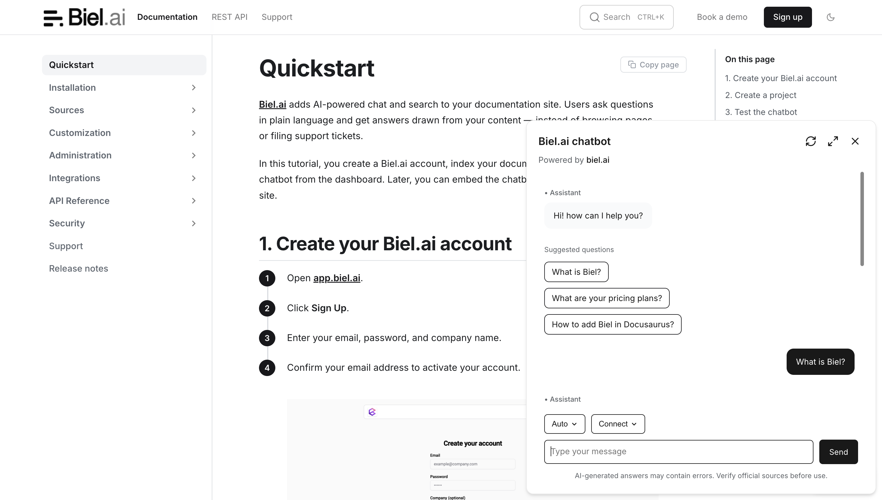
header-title | Type: stringDefault value: Company Name AITitle text for the chatbot header. |
input-placeholder-text | Type: stringDefault value: Type your messagePlaceholder text displayed in the chatbot's input field. |
connect-button-text | Type: stringDefault value: ConnectTooltip text for the Connect button in the chatbot header. |
mcp-url-text | Type: stringDefault value: MCP URLLabel for the MCP URL option in the connect dialog. |
mcp-url-description | Type: stringDefault value: Copy to clipboardDescription text for the MCP URL option in the connect dialog. |
mcp-claude-text | Type: stringDefault value: Claude CodeLabel for the Claude Code option in the connect dialog. |
mcp-claude-description | Type: stringDefault value: CLI commandDescription text for the Claude Code option in the connect dialog. |
mcp-copilot-text | Type: stringDefault value: Copilot (VS code)Label for the Copilot option in the connect dialog. |
mcp-copilot-description | Type: stringDefault value: Opens in a new tabDescription text for the Copilot option in the connect dialog. |
mcp-cursor-text | Type: stringDefault value: CursorLabel for the Cursor option in the connect dialog. |
mcp-cursor-description | Type: stringDefault value: Opens in a new tabDescription text for the Cursor option in the connect dialog. |
mcp-copied-text | Type: stringDefault value: Copied!Confirmation text shown after copying an MCP value to the clipboard. |
mcp-url-copied-description | Type: stringDefault value: URL copied to clipboardDescription text shown after copying the MCP URL. |
mcp-claude-copied-description | Type: stringDefault value: Command copied to clipboardDescription text shown after copying the Claude Code command. |
refresh-button-text | Type: stringDefault value: RefreshTooltip text for the refresh button in the chatbot header. |
send-button-text | Type: stringDefault value: SendText displayed on the send button next to the input field. |
sources-text | Type: stringDefault value: SourcesText displayed for introducing sources in messages. |
suggested-questions | Type: arrayDefault value: []An array of strings containing questions that will be shown to users when they open the chat. These questions help guide users on what they can ask the AI. |
suggested-questions-title | Type: stringDefault value: Suggested questionsThe heading text that appears above the list of suggested questions in the chat interface. |
settings-button-text | Type: stringDefault value: SettingsTooltip text for the settings button (reasoning mode selector) in the chatbot header. Only visible if your project has the reasoning mode plugin enabled. |
terms-checkbox-text | Type: stringDefault value: I have read and agree to the Terms & Conditions.Text displayed next to the terms acceptance checkbox. |
terms-description | Type: stringDefault value: Please review our <a href='https://biel.ai/terms' target='_blank' rel='noopener'>Terms & Conditions</a> before proceeding.Description text shown in the terms and conditions modal. |
terms-title | Type: stringDefault value: Chatbot Terms & ConditionsTitle text for the terms and conditions modal. |
copy-button-text | Type: stringDefault value: CopyTooltip text for the copy button on code snippets. |
copied-button-text | Type: stringDefault value: Copied!Text shown after copying a code snippet. |
think-mode-auto-text | Type: stringDefault value: AutoLabel for the Auto reasoning mode in the settings dropdown. |
think-mode-auto-description | Type: stringDefault value: Balances speed and qualityDescription for the Auto reasoning mode. |
think-mode-fast-text | Type: stringDefault value: InstantLabel for the Instant reasoning mode in the settings dropdown. |
think-mode-fast-description | Type: stringDefault value: Prioritizes speedDescription for the Instant reasoning mode. |
think-mode-think-text | Type: stringDefault value: ThinkLabel for the Think reasoning mode in the settings dropdown. |
think-mode-think-description | Type: stringDefault value: Takes longer for better accuracyDescription for the Think reasoning mode. |
welcome-message | Type: stringDefault value: "" A custom greeting message that appears when users first open the chat. |
biel-search-button
The <biel-search-button> component adds an AI-powered search bar to your site.
Usage
<biel-search-button project="YOUR_PROJECT_ID" button-style="rounded" search-placeholder="Search here...">Search</biel-search-button>
Search button properties
| Property | Description |
|---|---|
| Layout | |
project | Required Type: stringThe project ID. |
button-style | Type: stringDefault value: defaultAvailable values: default, roundedStyle of the button. |
custom-font | Type: booleanDefault value: falseWhen set to true, the Inter font will not be loaded. Useful if your site already uses a different font, enabling a quicker load time. |
hide-ctrl-k | Type: booleanDefault value: falseWhen set to true, the Ctrl+K text hides. |
hide-icon | Type: booleanDefault value: falseWhen set to true, the button icon hides. |
ai-icon | Type: stringDefault value: botAvailable values: bot, sparks, question-markSpecifies which AI icon to display in the search button. |
hide-avatars | Type: booleanDefault value: falseWhen set to true, hides avatars in the chat interface. |
api-key | Type: stringDefault value: `` API key for authenticating requests to private projects. Required for private projects with create_chat, project_search, and project_read permissions. Not required for public projects. |
Search modal properties
| Property | Description |
|---|---|
| Layout | |
hide-ask-ai-button | Type: booleanDefault value: falseWhen set to true, the "Ask AI" button is hidden from the search results. |
hide-descriptions | Type: booleanDefault value: falseWhen set to true, hides descriptions in search results for a cleaner interface. |
hide-filters | Type: booleanDefault value: trueWhen set to false, enables the source filter bar in the search modal, allowing users to narrow results by category. Requires at least one active search filter configured in your project settings. For more details, see Search filters. |
hide-navigation-buttons | Type: booleanDefault value: falseWhen set to true, hides navigation buttons (up and down arrows, enter, escape) in the search modal for a simplified interface. |
modal-position | Type: stringDefault value: top-centerAvailable values: center, top-center, top-left, top-right, center-left, center-right, bottom-left, bottom-right, sidebar-left, sidebar-rightPosition of the search modal. Use sidebar-left or sidebar-right to dock as a side panel. |
stacked | Type: booleanDefault value: falseWhen set to true, displays search results in a stacked layout. |
clean-titles | Type: booleanDefault value: falseWhen set to true, removes site names from page titles that follow the format "Page Title |
| Text | |
ai-result-fragment | Type: stringDefault value: "Ask AI to answer your question"Text displayed in the AI result section of the search modal. |
search-placeholder | Type: stringDefault value: "Search or ask AI..."Placeholder for the search input. |
Search chatbot modal properties
Most properties that can be defined in <biel-button> for configuring the chatbot modal can be set in the biel-search-button.
For details, see Chatbot modal properties.
Common customizations
Change the chatbot title
By default, the chatbot header displays "Company Name AI". Set the header-title property to show your own title:
<biel-button project="YOUR_PROJECT_ID" header-title="Acme AI">Ask AI</biel-button>
Change the button text
Replace the inner text of the element to change what the button says:
<biel-button project="YOUR_PROJECT_ID">Help</biel-button>